AN-003 · application note · quant
Bitcoin Regime Analysis, Part 1: What the Data Looks Like Before You Model It
Bitcoin’s returns are almost unpredictable in the mean, wildly structured in the variance, and nothing like a normal distribution. This is a walk through the checks that establish that, and why they point at Hidden Markov Models.
- published
- length
- 8 min·1,612 words
- application
- quant/research
- terms
- cryptocurrency, bitcoin, regime-analysis, time-series
I spent most of my career in Natural Language Processing, where Hidden Markov Models are a standard tool. You assume a hidden state — a grammatical context, say — that you never observe directly, and you infer it from the words it generates.
Markets are described in almost exactly that vocabulary. People talk about being “in a bull regime” or “in a high-volatility regime”, which is to say: an unobservable state that generates the returns you can see. The vocabulary matched a model I already knew, so Bitcoin became my first project moving into quantitative finance.
But before pointing any model at data, I wanted to answer a more basic question: what is this data actually like? Not “can I predict it” — I’m deliberately not building or testing a trading signal here. Just: what shape is it, which of my usual assumptions survive contact with it, and does that shape justify reaching for a regime model at all?
This post is that walk-through. If you’re arriving from ML or software and market data is new, this is roughly the order in which my assumptions broke.
The data is 1-minute Bitcoin bars from Binance, pulled with freqtrade, aggregated to 1-hour, running February 2024 through late July 2025.
§First look: the thing does have phases
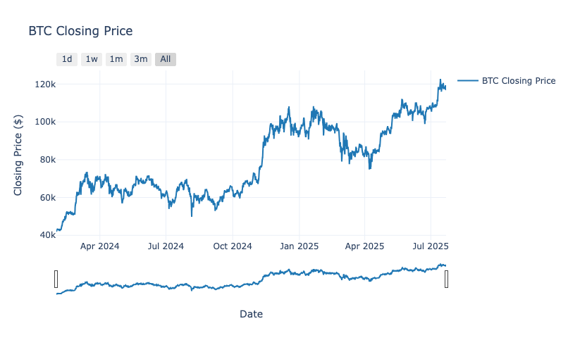
Figure 1: Bitcoin price, Feb 2024 – Jul 2025
Two drawdown-and-rally cycles inside a general climb. A steady rise into late 2024, an acceleration into January 2025, a correction through March and April, then new highs above $115–120k by July.
You can already see something regime-shaped by eye: stretches that behave differently from each other, rather than one uniform process. That’s suggestive, and it’s also exactly the kind of pattern humans hallucinate in random data. So the rest of this post is about whether it survives measurement.
§The first instinct, and why it fails
Coming from ML, the reflex is to treat this as a supervised problem. Features in, next return out, minimise some loss.
Here’s what that reflex runs into:
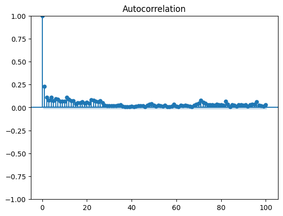
Figure 2: Autocorrelation of hourly returns
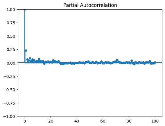
Figure 3: Partial autocorrelation, hourly returns
Both are essentially zero past the first couple of lags. There’s a small but real lag-1 effect — the sort of thing that shows up in any large sample and usually reflects market microstructure rather than opportunity — and then nothing.
Past returns tell you close to nothing about future returns, linearly. If you come from a field where signal is usually somewhere, this is the first genuine surprise. It isn’t a data quality problem or a feature engineering failure. Weak linear predictability in liquid markets is the expected result, because anything stronger would already have been traded away.
So if the mean is a dead end, the interesting structure has to be somewhere else.
§It’s in the spread, not the average
It is. Look at how much returns move around, rather than which way:
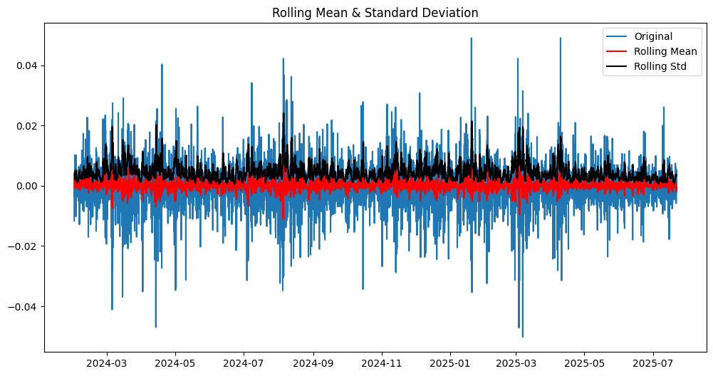
Figure 4: Rolling mean (red) and rolling standard deviation (black) of hourly returns
The rolling mean sits flat near zero — consistent with the ACF plots, no directional signal. But the rolling standard deviation moves substantially, with a pronounced burst around the March–April 2025 drawdown and smaller spikes elsewhere.
This is volatility clustering, and it’s the single most reliable feature of financial data: calm periods follow calm periods, violent periods follow violent periods. Returns are hard to predict; how big returns will be is much less so.
If you want the one-line version of why quant finance looks the way it does: the mean is nearly unpredictable and the variance is quite predictable, so an enormous amount of the field is really about modelling variance.
§Your normal-distribution toolkit does not survive
The next assumption to go is Gaussianity, and it goes badly.

Figure 5: Distribution of hourly returns
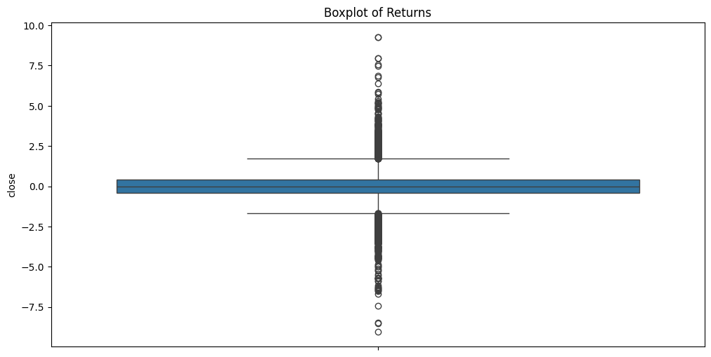
Figure 6: The same returns as a boxplot — note the outlier density
A very sharp peak at zero, and then far more extreme values than a bell curve allows. Hourly excess kurtosis is 9.44. For reference, a normal distribution has 0. Skewness is mildly negative at −0.10.
The Q-Q plot makes it unmistakable — if the data were normal, the points would sit on the diagonal:
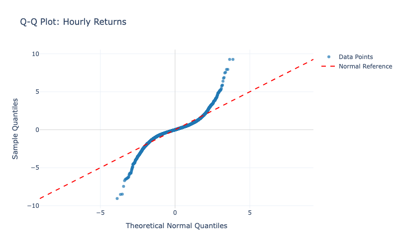
Figure 7: Q-Q plot, hourly returns. The S-shape is fat tails in both directions.
Both ends peel away from the line. Extreme moves happen far more often than a Gaussian predicts, in both directions.
What this costs you in practice: any model that assumes normal errors will systematically understate how bad a bad hour can be. Not slightly — the tails are where the difference lives, and the tails are exactly what risk is about. It’s the reason fat-tailed likelihoods, such as Student-t, are standard here rather than exotic.
§Does it improve if you zoom out?
Somewhat. Aggregating returns to longer horizons pulls them toward normality, which is what the Central Limit Theorem promises — but slowly, and never all the way:
| Timeframe | Skewness | Excess Kurtosis |
|---|---|---|
| 1 hour | −0.097 | 9.44 |
| 1 day | +0.494 | 2.27 |
| 1 week | +0.257 | 0.76 |
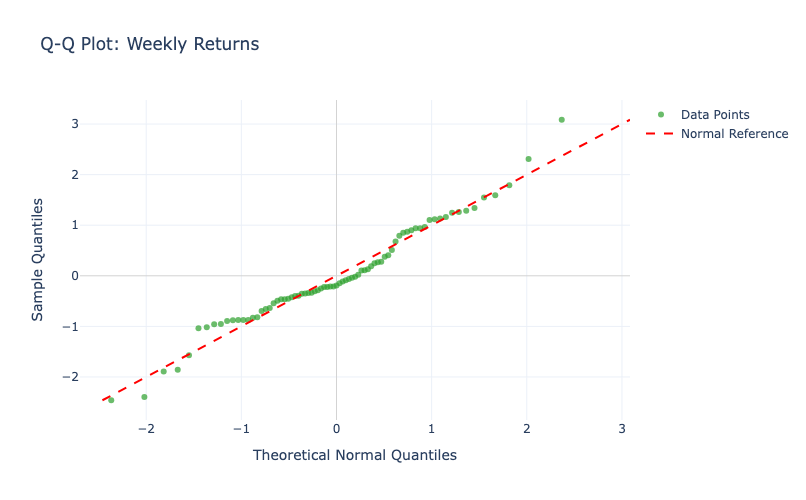
Figure 8: Q-Q plot, weekly returns — closer to the line in the middle, still deviating at the ends
Weekly returns hug the line through the centre and still misbehave in the tails. Also notice the skew flips sign as you aggregate: mildly negative hourly, clearly positive daily and weekly.
The practical reading is that the shorter your horizon, the less normal your world. If you work intraday, the Gaussian assumption isn’t an approximation you can wave through.
§Is there a clock?
Plenty of things in the world have a daily or weekly rhythm, and it would be convenient if crypto did too. A seasonal decomposition of log price says: barely.
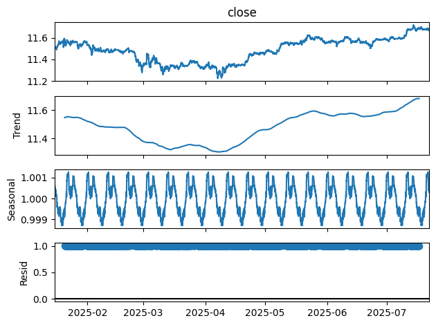
Figure 9: Seasonal decomposition — trend, seasonal component, residual
There’s a trend that tracks the medium-term moves, a seasonal component oscillating about ±0.1% around 1.00, and residuals that dominate everything at short horizons.
Running the numbers on a roughly 10-day period, the seasonal component explains 0.00088% of total variance and the residual 0.0049%. Both are essentially nothing.
So: a periodic structure exists, technically, and it is far too small to build on. Worth knowing mostly so you don’t go looking for it twice.
§Does the past influence the future at all?
One more angle, and this is the one that pointed most directly at regimes.
The Hurst exponent asks whether a series trends or reverts. Below 0.5 means mean reverting — moves tend to undo themselves. Around 0.5 is a random walk, no memory. Above 0.5 means persistent — moves tend to continue.
I computed it on a rolling window, for both returns and volatility. The split between them is the interesting part:
Date        Returns H  Volatility H  Returns Type      Volatility Type
-----------------------------------------------------------------------
2025-03-24  0.2831     0.8180        Mean reverting    Strong persistent
2025-03-27  0.6501     0.4990        Strong persistent Random walk
2025-03-30  0.7408     0.7689        Strong persistent Strong persistent
2025-04-05  0.6872     0.9093        Strong persistent Strong persistent
2025-07-19  0.2264     0.8137        Mean reverting    Strong persistent
2025-07-22  0.4272     0.7366        Mean reverting    Strong persistent
Returns swing about. Mostly above 0.5, with real stretches of mean reversion — the behaviour of the series genuinely changes over time rather than holding one character.
Volatility is persistently high, typically 0.6 to 0.9 and rarely dropping to 0.5. It has long memory: a volatile period stays volatile for a while, and this holds far more consistently than anything the returns do.
That asymmetry is the whole story of this post in one table. The direction of the market has weak, unstable memory. The intensity of the market has strong, reliable memory.
§One box to tick before modelling
A quick housekeeping check, because most time series methods assume it.
Prices are non-stationary, which is unsurprising — the mean drifts, and $30k Bitcoin and $115k Bitcoin are not draws from the same distribution. Returns, on the other hand, pass an Augmented Dickey–Fuller test comfortably: test statistic ≈ −25.49, p well under 0.01.
So returns are stationary in the mean but very much not in the variance, which is precisely the setting these models are built for. Model returns, not prices — and let the variance be state-dependent.
§Where this leaves us
Pulling the threads together, Bitcoin’s hourly returns are:
- Nearly unpredictable in direction. ACF and PACF are flat past lag 1.
- Highly structured in magnitude. Volatility clusters, visibly and persistently.
- Far from normal. Excess kurtosis of 9.44 hourly, improving with aggregation but never resolving.
- Not on a clock. Seasonality explains under 0.01% of variance.
- Long-memoried in volatility, unstable in returns. Hurst 0.6–0.9 for volatility; returns wander across the 0.5 line.
- Stationary in the mean, not in the variance. ADF rejects a unit root on returns.
Now put that next to what a regime-switching model assumes. It assumes the series is generated by one of several unobserved states; that each state has its own mean and its own variance; that states persist for a while before switching; and that you infer the state from the observations it produces.
Every one of those assumptions lines up with something in the list above. The persistence matches the volatility memory. The state-specific variances match the clustering. The weak mean structure explains why a single-regime model with constant parameters was never going to work.
Which is a satisfying place to land, because it’s the same model I’d been using on sentences. Hidden state generates observable output; infer the state from the output. In NLP the hidden state was grammatical context and the output was words. Here the hidden state is a market regime and the output is returns.
Part 2 fits those models — starting with returns alone, then adding volatility, volume, and fractional differentiation — and looks at which features actually make the regimes separate.